A Few Thoughts on Art
by Steven Seward
In our modern world, art can be many different things. In fact it can be almost anything as long as a person of influence says so. The age-old concept of art being something of beauty has been replaced in some circles by totally different ideas. Some people think art should be absurd, or provocative, or shocking, or even ugly and repulsive, and the list goes on and on and keeps expanding all the time.
More than a hundred years ago, nearly everyone agreed on what art was and what was considered good art. The thought that art should not be beautiful would have seemed ludicrous to nearly every known civilization of the past. In the world of Modern Art, about all anyone can agree on is that art should make some sort of social statement about society (more specifically a statement against society, no matter how good or bad that society may be).
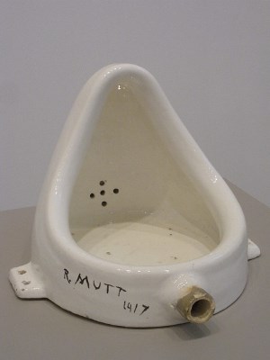
If Marcel Duchamp had signed his name on a urinal from a men’s bathroom and called it “art” during say, the 17th Century, he would have been dismissed as some idiotic lunatic, or worse. Conversely, in the year 2005, this piece was voted “the most influential artwork of the 20th Century” in a survey of 500 noted artists, curators, critics, and dealers.
Please don’t get the idea that most modern artists and their patrons feel this way. The number of people who have bought into the Modern Art movement is relatively small. They just appear to be larger because all the fun news stories revolve around them. Try to imagine this news teaser: “Artist paints pretty picture. Buyer is very satisfied. Details coming up on Eyewitness News at 11”. This crack journalism would surely die a miserable death.
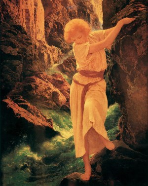
Underneath this façade, traditional art has been plodding along uninterrupted since the days of the Old Masters. To help illustrate my point, ponder this question. Who were the three most poplar artists (painters) in America during the 20th century? Answer: Maxfield Parrish, Norman Rockwell, and Andrew Wyeth. All three of them; traditional painters. This is my own list based on anecdotal observation, but the choices are so obvious that I doubt they can be seriously challenged. You may not be as familiar with Parrish since he was more popular in the first half of the century, but it is estimated that at one time every fourth household in America owned a print of one of his paintings.
As you might have guessed, it is in this background of traditional art that I place myself. I have no pretensions about being particularly innovative, and I make no sweeping statements about society at large, only particular insights of individual people in their world. I have no quarrel with Modern Art as long as somebody enjoys it. In fact I enjoy some of it. If a person likes Duchamp’s urinal, it must have value for them, though admittedly I don’t see many urinals hanging on somebody’s living room wall. Most of them are in the bathroom where they belong.
I have chosen to paint portraits. Every once in a while someone (especially another artist) will ask me “What kind of art do you really want to do?” By this they are implying that I must be taking on portrait commissions as a way to support myself so that in my spare time I can paint what I really like. Perhaps the questioners cannot understand an artist getting inspired by painting a person not of his own choosing.
It just so happens that I like painting people more than any other subject, and I feel that I have enough of my own embedded inspiration to make an excellent portrait of anyone. I always thought it was natural that I should gravitate towards portraiture. In fact, the few paintings that I do in my spare time are pretty much indistinguishable from the ones I get paid for.
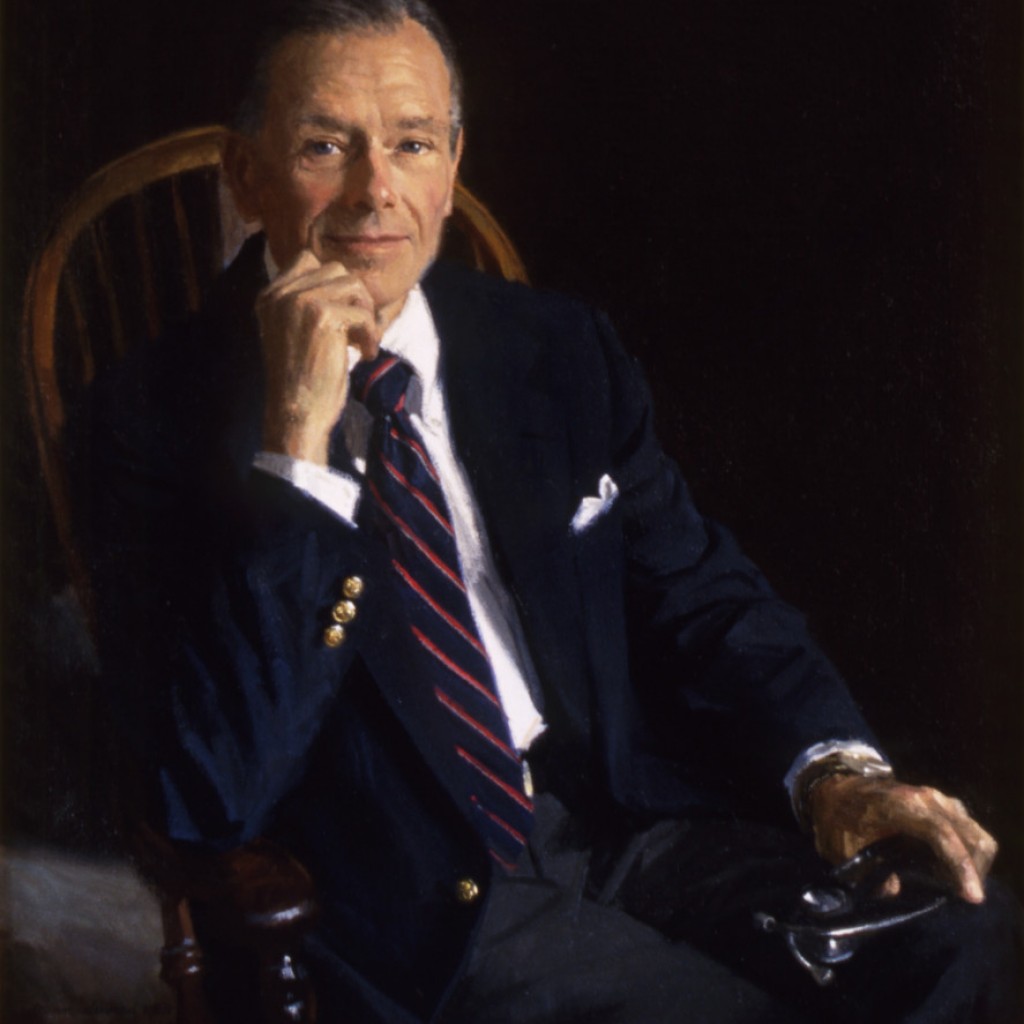
I am not a big fan of many typical modern-day portraits. More specifically that is, a painting of someone staring at the viewer, with a blank background or completely dark background, as if the person were standing in outer space. If well done, these can indeed be fine paintings, and occasionally I will execute such a portrait myself. But I feel this can be limiting, and so much more can be added, giving the painting more layers of depth and greater profoundness.
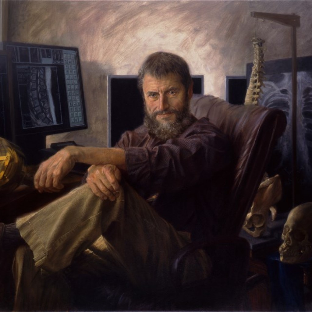
I like to add something to the painting that is a part of the person’s life, even if it is simple, such as a room setting that the person frequently inhabits. Sometimes it is easy to find visual objects that are meaningful to the sitter, for instance, x-ray equipment for The Radiologist or flowers for a gardener. Sometimes it is not so easy. What do you put in a portrait of a psychologist? Or a therapist? Or a politician? (Feel free to invent five humorous answers for that last one).
By adding these extra elements I feel the portrait can tell more of a story than just the person’s image, and will create a more interesting picture. There are examples throughout history of painters who had a similar approach, especially in early Flemish painting. Hans Memling, Quentin Massys, and Peter Paul Rubens are good examples. Another fine exponent is the German-born Hans Holbein.
There are some obvious restrictions when painting commissioned portraits, especially with adults. For instance, I would meet with great resistance if I were to try and pose a 62 year-old bank president in his bare feet and shorts, climbing a tree. But I could do that with a 9 year-old boy. Kids can be put in all sorts of crazy situations and wear any type of clothing. They can also dress-up and be formal. Few would object. I often get higher compliments on my paintings of children than on any other paintings. I think this could be partly because I manage to capture this spontaneity in children.
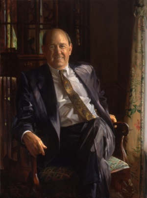
Even though portraits of adults often carry more restrictions, the number of creative possibilities is still astronomical. There is only one particular creative speed bump that I run into on a regular basis when painting men. This is the dreaded “business suit”. Whoever invented this thing did not have artists in mind. Don’t get me wrong. I happen to like wearing suits and I do so quite often. It serves a wonderful and important function. It shows that you respect other people and think highly enough of them to don this uniform. However, as an artistic and design element in a picture, it is for me a big black hole.
Men used to wear more exciting clothing, making it easier for the artist. Just look at paintings of royalty from the Renaissance through the Baroque era. Today, unless you are Doc Severinsen or Herb Tarlek, your suit will have no color, no designs, no exotic patterns, and from a distance will look just like everybody elses. This is why women hate us. They have to do all sorts of decision-making about their appearance before going out in public. Men have to choose a tie.
So when it is necessary to paint a man in a business suit, I try every way I can to make it different and interesting. The easiest way is just to make the suit act as an area of relief surrounded by more active pictorial elements, but I don’t want to do this every time. Unusual lighting helps a lot. At the very least I will do something my father taught me, what he called making the suit look “smart”. This entails making the folds look crisp and masculine instead of mushy and flabby.
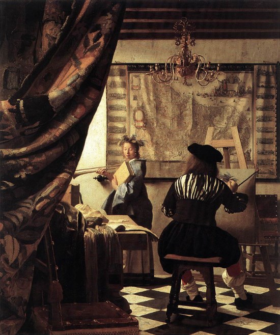
When I was learning under my father, he used Rembrandt more often than any other artist, as an example from which to learn. He also introduced me to Frans Hals, Jan Vermeer, and Peter Paul Rubens. These are the four main painters from the Golden Age of Dutch/Flemish Painting that had the greatest impact on my education. John Singer Sargent also figured significantly into my studies. As an adult I discovered the work of William Bouguereau, and my two favorite artists of the 20th Century, Alphonse Mucha and Gustave Klimt. These of course are just a few highlights of literally hundreds of artists that I have been looking at and studying.
All of my early work was created using “direct painting” methods. It is sometimes known by the Italian term “alla prima”. This means that the artist mixes on his palette the exact shade of color that he wants to be seen on the canvas. He then brushes it on the canvas in a manner that is meant to cover opaquely. Corrections are simply painted on top of previous layers, which become covered up.
Because of my influences from Rubens and Bouguereau, I began experimenting with “indirect painting”, also known by various phrases as “built-up layered technique” or “glazing over an underpainting”. In this approach the artist uses semi-transparent paints to build the picture with overlapping layers. The underneath layers are meant to show through and merge visually with the uppermost layer. Thus the artist does not actually have to mix the exact shade of color in one step, but may choose to visually blend colors from the different layers of paint to achieve the final result. Certain optical effects are possible using this method that are not possible using the direct method.
I spent more than a decade developing this technique before I was happy with my results. Today I more or less use combinations of both techniques in my paintings. You may have also noticed that some of my paintings are very detailed, and others are more broadly and loosely painted. This is a function that the picture mostly dictates. Some pictures beckon me to get my finest small sable brushes and paint tiny details, while others draw my senses into showing painterly brushwork. I feel equally at home in either style.
Now that you have heard some of my thought processes, maybe you will enjoy looking at my portrait paintings in a slightly different light (no pun intended).
